


![[Most Recent Quotes from www.kitco.com]](http://kitconet.com/charts/metals/gold/t24_au_en_usoz_2.gif)
![[Most Recent Quotes from www.kitco.com]](http://kitconet.com/charts/metals/silver/t24_ag_en_usoz_2.gif)
![[Most Recent USD from www.kitco.com]](http://www.weblinks247.com/indexes/idx24_usd_en_2.gif)
The Quality of the Jobs
Friday, August 05, 2005
The nonfarm payrolls number came in at +207,000 today, with big gains in retail trade and food service, while the manufacturing sector again declined. The headline number was hailed as good news for the economy as it beat expectations that were around +180,000.
This report is consistent with patterns that have developed over the last few years - strength in certain areas of some sectors, most with some connection to real estate and/or the wealth effect associated with rising home values.
Today we look back at the last four years of job creation and find that outside of the education and health services sector and a few big numbers within the trade, transportation, and utilities sector, the job creation story for the last few years can pretty much be summarized as:
Now, these three groups do not cover all job creation for this period, but they cover more than you would think they should for a "normal" economic recovery - this economic recovery seems to be anything but "normal".
It appears that we have a real problem with job creation in this recovery - not in the number of jobs being created, although the totals are historically weak, but in the quality of the jobs being created. Of course, no one seems to be paying too much attention to this problem because most people are too mesmerized by the rapidly rising value of their home, and the daily quandary of what to do with all that home equity that is piling up.
So, let's look at job creation in the U.S. over the last four years. All charts are year-over-year changes from June to June starting in 2001 and ending with the June 2005 data released last month. The June 2001 date marked the bottom of the last recession.
The first chart includes all major sectors, and includes the familiar depiction of manufacturing job loss. On the surface, this appears to be a fairly broad based pattern of job creation, at least for the last two years, as indicated by the yellow and blue bars.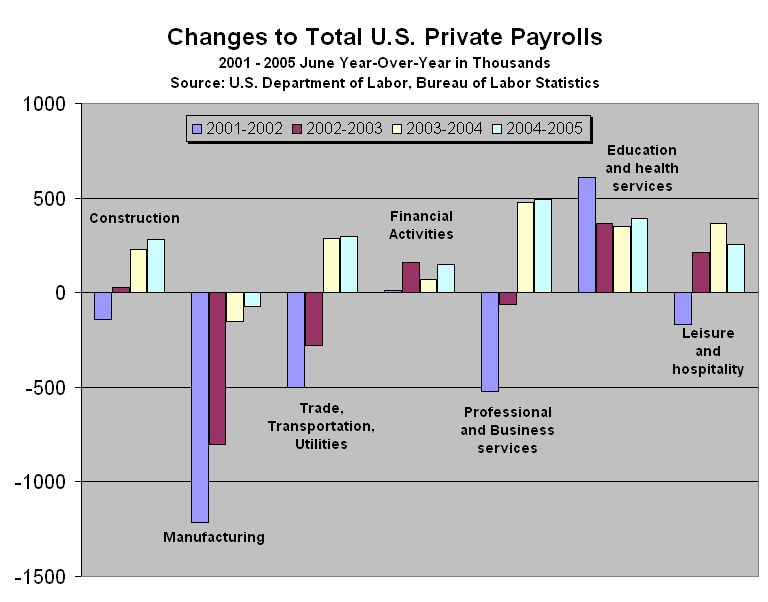
Click to enlarge
But a closer look at the sectors reveals that this high level view of job creation is not what it seems. The following charts provide details for the construction, financial activities, professional services, and leisure and hospitality sectors. The scale is the same for all four so you get a clearer picture of the relative number of jobs being created or lost by sector and by category.
[The trade, transportation and utilities sector is not included here. It includes such interesting job categories as building material and garden supply as well as trucking - both related to the wealth effect. We'll dig into these numbers some other time.]
Starting with the construction sector, we find that job creation is dominated by home construction and residential specialty trade - the specialty trade guys are the ones that have been installing granite countertops all across the country for the last few years. Only in the last year has nonresidential work picked up and it is still comparatively small.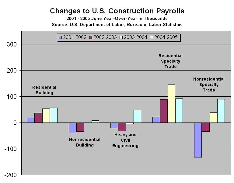
Click to enlarge
Compared to the other sectors, very few jobs have been created in the financial activities sector - what jobs have been created, not surprisingly, are credit and real estate related. Does anyone else find it odd that only a little more than 100,000 real estate jobs have been created over the last four years? It feels like it should be a million or more.
Click to enlarge
The professional services chart is pretty disappointing - in the last year or so, it's mostly temporary jobs and employment agency jobs! It's nice to see a pick up in computer related jobs and it looks like the janitorial and lawn-mowing industries are booming, but it would be much better to have some bigger yellow and blue bars on the left side of the chart, instead of just the big ones on the right.
Click to enlarge
And, finally we come to the chart that tells the most interesting part of the jobs story. In the last four years, we have created about 700,000 jobs for waiters, busboys, cooks, greeters, valets, bartenders and bouncers. It looks like a lot of people are spending a lot of money eating and drinking out. Since this part of discretionary spending is the easiest and fastest to cut back on, if and when people begin feeling less wealthy due to a cooling real estate market, look for trouble in this area.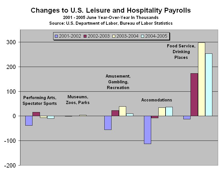
Click to enlarge
By the looks of all these charts, recent job creation really doesn't look that healthy - most people have given up on increases in manufacturing jobs, but now it seems that even good service jobs are hard to come by. Nothing against waiters, temporary help, and granite countertop installers, but these are not the type of jobs you expect from the world's economic superpower.
It seems that as long as home prices continue to rise, and people continue to feel wealthy, they will continue to spend money at restaurants and at The Home Depot, while employers remain skittish about hiring permanent help.
Wonderful!

10 comments:
Excellent analysis of the jobs picture! Other than Lou Dobbs, a problem little addressed by mainstream media and the politicos.
Wake up America!
how can you just ignore all the education and health services jobs?
Fine work - now I'm depressed again.
Regarding the chart for "Construction Payrolls," what is "Non Residential Specialty Trade"? It seems to me that, if you add that one to "Residential Speciality Trade," those two, and not home contsruction and remodeling, are what dominate the chart. Also, it seems to me that "Speciality Trade" jobs are pretty high-paying jobs, albeit high paying jobs tied to real estate (commercial and residential).
It turns out that specialty trade within the construction sector is just construction subcontractors, as indicated here, and I believe that the construction category would then be the construction companies. So, it's pretty hard to separate out home improvement from construction here - I've updated the bulleted list.
Anon 7:55 - Sometime next week I'll take a look at the other sectors - Manufacturing, Trade/Transportation/Utilities, and Education/Health.
I have been looking at the age decomposition. Table A-6, employment by age, tells us these YOY deltas (non-adjusted, July'04 to July'05, millions):
16-17 +0.09
18-19 +0.05
20-24 +0.16
25-34 +0.14
35-44 +0.08
45-54 +0.66
55-?? +1.40 (!)
total +2.58
These are the numbers, according to http://www.bls.gov/news.release/empsit.t06.htm and i'm at a loss to explain them.
Taking this at face value, it means in net terms that 54% of net employment growth was in the 55+ age segment, and 80% in the 45+ segment. The 20-45 segment got just 8.5%! Ideas, anybody? Is this where offshoring hits? Experienced-but-not-old-hands-pulling-the-strings positions being outsourced?
Looking at historical data with graphs on the BLS site reveals that there is an employment peak in the age group born around 1960 that moves through the ages. I wouldn't have thought the baby boom effect would be so pronounced.
In your job numbers you haven't subtracted the additional birth/death model jobs, and the phony seasonality. When that is done, in most months there is either no job growth or negative job growth.
anonymous: Seasonal adjustment is not "phony". It can have imprecisions because the weather and, to a lesser extent, other triggering events are never exactly the same, but look at a graph of the raw numbers and you see gyrations of a very regular pattern, which the adjustment is supposed to compensate for.
Post a Comment