


![[Most Recent Quotes from www.kitco.com]](http://kitconet.com/charts/metals/gold/t24_au_en_usoz_2.gif)
![[Most Recent Quotes from www.kitco.com]](http://kitconet.com/charts/metals/silver/t24_ag_en_usoz_2.gif)
![[Most Recent USD from www.kitco.com]](http://www.weblinks247.com/indexes/idx24_usd_en_2.gif)
There's a Housing Jobs Bubble In San Diego
Tuesday, July 12, 2005
Yesterday we looked at the national payrolls data from the Bureau of Labor Statistics from 2001 to the present. The percent change for all major sectors of employment were charted and the construction sector was examined in detail. It revealed some interesting trends between 2001 and mid-2003, then some different and equally interesting trends from mid-2003 to present.
Although no "bubble criteria" were identified, it was nonetheless determined that there is no "housing jobs bubble". At the national level since mid-2003, job creation has expanded beyond those sectors most closely associated with real estate and the broader economy has been creating jobs, which while significantly influenced by home equity fueled consumer spending, can not be directly linked to housing.
Today we look at a similar set of charts, but this time, we zoom in on one of the country's real estate hotspots, San Diego, California (San Diego county, to be exact). Surprisingly, all the raw payroll data is available from the California Employment Development Department website in Excel spreadsheet format - very convenient.
The first chart is the same format as yesterday's first national chart. It covers all major payrolls sectors and contains all the same categories and colors:
Click to enlarge
Yesterday's national chart is provided again here for easy reference:
Click to enlarge
The first thing to notice is that the lines on the San Diego chart are a lot more squiggly than the lines on the national chart. We're not sure why this is. The second thing that strikes the eye is that the pink line is all by itself, way at the bottom on both charts - manufacturing, not surprisingly, lags all other sectors by a wide margin both nationally and in San Diego.
But, getting to the point of today's post, there are two other major differences. In San Diego, construction is the clear leader in percent change, while education/health services is in fourth position, behind financial activities and leisure/hospitality. Also, the scale is quite different - in fact it is two-to-one. San Diego jobs in construction, financial activity, and leisure/hospitality are off the scale of the national chart - the increase in construction is more than double that of the leading sector on the national chart.
They must be having a heck of a time in San Diego with all the new construction, easy credit, and leisure activities.
So, we could say that there is a housing jobs bubble in San Diego just based on the first chart, but there is more - below is a breakout of the San Diego construction jobs into its component parts:
Click to enlarge
Again, yesterday's national chart is provided here for easy reference:
Click to enlarge
The categories are different on these two charts - for some reason the state and federal government use different classification systems for the detailed data. Once again notice that the scale is two-to-one. Also notice that since the San Diego chart appears to include residential and nonresidential jobs within the same category, given what the national chart indicates for the difference between these two, we can only hazard a guess at what the San Diego residential construction curves would look like - a 60% increase? a 100% increase?
Again, a clear indication of a housing jobs bubble.
Lastly we look at finance activity, without which none of the above would be possible: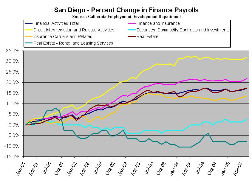
Click to enlarge
Presumably, credit intermediation is where the magic really happens, although we're not sure what the difference is between that and finance/insurance. Whatever the case, it apparently takes more people to finance and insure a house than to sell it, given where the real estate curve is relative to the other curves.
One thing is clear - renting houses in San Diego is not a growth industry.
At least not recently - that may all change someday.

2 comments:
Well, one would think for the nationwide trends the law of big numbers with its smoothing-out effect would kick in, no?
So in the small-region case, there is simply a higher impact of fluctuations on trend.
This data is not seasonally adjusted - that explains the squiggly lines.
The seasonally adjusted end points would be slightly lower than they appear on the charts because we are at a seasonally high point of the year, but the trend is the same.
Post a Comment