


![[Most Recent Quotes from www.kitco.com]](http://kitconet.com/charts/metals/gold/t24_au_en_usoz_2.gif)
![[Most Recent Quotes from www.kitco.com]](http://kitconet.com/charts/metals/silver/t24_ag_en_usoz_2.gif)
![[Most Recent USD from www.kitco.com]](http://www.weblinks247.com/indexes/idx24_usd_en_2.gif)
A Topping Pattern
Friday, July 08, 2005
Normally on the first Friday of the month, when the Department of Labor releases the employment data for the previous month, we would first check to see what Larry Kudlow has been writing over at the National Review, and then maybe talk about something interesting that was said during his once-a-month, special appearance on CNBC Squawk Box.
But, after yesterday's events, that sort of thing just doesn't seem that important right now.
Instead, we will take a look at a few charts based on Department of Labor Statistics data, and try to shed some new light on the seasonal adjustments and birth-death model adjustments that many people continue to talk about.
The first chart is the one that gets the most attention on the first Friday of the month - the seasonally adjusted, monthly change in total non-farm payrolls. This chart looked truly horrid back in 2001 and 2002, but since mid-2003, when the numbers transitioned from negative to positive there has been a steady stream of positive numbers, which continues to this day.
Click To Enlarge
The seasonally adjusted data includes both the seasonal adjustment and the infamous birth/death model adjustment - these two adjustments have been the source of much speculation and consternation in recent years.
The corresponding raw data, or "not seasonally adjusted data", is shown below. Looking at this it is clear why seasonal adjustments are required - there are significant cutbacks in January, after the holiday shopping season, and in the summer for yearly plant shutdowns. Except for these times of the year, typical monthly job creation is between 500,000 and 1 million, rather than the 100,000 to 200,000 headline number typically heard on the evening news.
Click to Enlarge
The not seasonally adjusted data includes the birth death/death adjustment as part of the total. In January of each year, when a revision is performed for the preceding year, the actual state unemployment insurance data replaces the estimates generated by the birth/death model. There have been some massive revisions in the past, but last year the revision was comparatively small, indicating that the estimates have improved.
The seasonally adjusted total payroll data, the cumulative total number of people employed in the U.S., has been rising gradually over the last couple years. Not as fast as in previous "recoveries", and barely keeping pace with population growth, but clearly rising.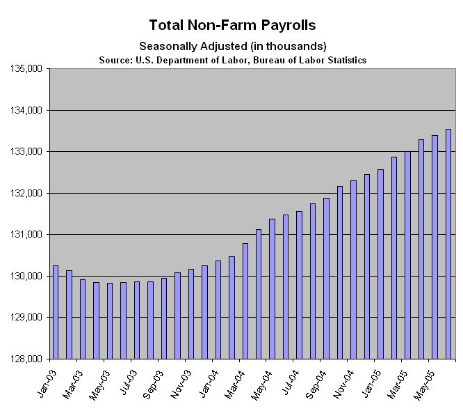
Click To Enlarge
While the not seasonally adjusted data also has the same general trend it is much more, shall we say, seasonal.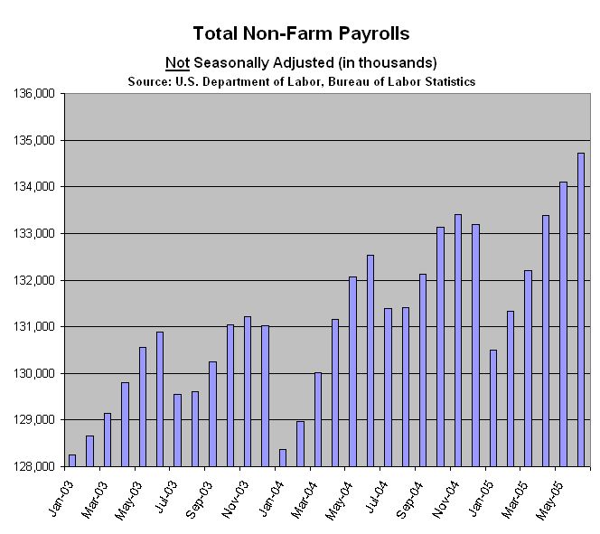
Click to Enlarge
Now to the interesting charts and to the point of this exercise.
Plotting the year-over-year change in payrolls since the beginning of 2003 shows a clear topping pattern over the last seven or eight months. Now in the neighborhood of 2 million new jobs, year-over-year, that works out to be around 170,000 new jobs per month, on average, which is roughly the number of new jobs necessary to keep pace with the rising population.
Click to Enlarge
[Note: Year-over-year comparisons were also found to be particularly revealing when examining Southern California real estate prices, as we found here - by the way, the $600,000 condo with the convenient public transportation which was linked to in this post is still for sale - now only $565,000.]
It is comforting to see that the year-over-year seasonally adjusted and not seasonally adjusted curves look basically the same, as they should, since using year-over-year comparisons is essentially the same as seasonally adjusting.
Click to Enlarge
So, today's number came in at 146,000, and there were some slight upward revisions to the two previous months. What does that mean? Are things good, bad, or indifferent in the labor market?
Considering that almost half of all new jobs created in the last year were real estate related, and with all the talk of housing bubbles, this topping pattern should be cause for some concern. What happens if the number of real estate related jobs fails to increase at the rate to which we have become accustomed? Or worse, what happens if housing related employment falls? What sector takes up the slack, just to maintain pace with the increase in population?
Those questions will be answered over the next year.
And what about the birth/death model adjustments? According to the Labor Department's description of the birth/death model calculations, it may not be very reliable during "economic turning points": The most significant potential drawback to this or any model-based approach is that time series modeling assumes a predictable continuation of historical patterns and relationships and therefore is likely to have some difficulty producing reliable estimates at economic turning points or during periods when there are sudden changes in trend. BLS will continue researching alternative model-based techniques for the net birth/death component; it is likely to remain as the most problematic part of the estimation process.
The birth/death model adjustment accounts for roughly 20% of the reported "not seasonally adjusted" data - could there be a massive revision next January due to a turning point that may be indicated by the topping pattern?
We'll find out in six months.

1 comments:
Could you take a look at the household data sometime?
I realize that the only time people use that data is when it supports a conclusion they've already made, but there's probably lots of interesting stuff there.
Post a Comment