


![[Most Recent Quotes from www.kitco.com]](https://lh3.googleusercontent.com/blogger_img_proxy/AEn0k_tDNZyWP_ZbZeF891y49tVVBYppceanhOIYSHBBSdxRl_jM80X_P8n9TEYczJtlgG7dKHoTAg5WPi8sPOdFv5ljzpJcZ1LjuQLjWUVtx_qv6harnw1UiyJrIfA9lIz6=s0-d)
![[Most Recent Quotes from www.kitco.com]](https://lh3.googleusercontent.com/blogger_img_proxy/AEn0k_saaRu85mCxSVuxLc96lzjKrDlS5nvOmrp2WehT4x9Jlr6c1GWx4IGPoVgGzk5N7L9Pdab7gFM-jd2LFdT0EyTx3qRZEfD7uAYao7zbBwaiXGpzk_iVhGK3eO1CaT3avbo=s0-d)
![[Most Recent USD from www.kitco.com]](https://lh3.googleusercontent.com/blogger_img_proxy/AEn0k_uqA3uEBfINMGEHGdeAUrCXPAeTG9soU0OT2SpqgnKSDqAQ0-tEdLa3WsneIFWQD7bzITMZUsyRb22ygNlr0zwwxbM11AnyTh6V2fpjT6eUaOCluXR4MAfX=s0-d)


Fool Me Twice ...
Thursday, December 15, 2005
Now that the Bush administration has taken the advice of conservative legislators and Wall Street economists to proudly herald the dawn of a new era of sustained economic growth, it seems reasonable to take a closer look at the data being used to draw those conclusions - to see how the case is being made.
After the foreign policy adventures of the last few years, perhaps more people should think twice about the conclusions being offered regarding our economy - to question whether selective data is being used or if anything is being distorted in any way.
Yesterday, on the same day that the trade deficit set a new record and it was announced that risky mortgages could be harder to get, Treasury Secretary John W. Snow, Commerce Secretary Carlos M. Gutierrez, and Labor Secretary Elaine L. Chao gave a year-end briefing on the American economy without once mentioning the word "deficit" or "debt" in their prepared remarks.
That shouldn't be surprising - the trade number is a bit embarrassing, and cutting back on "risky lending" may impact the much trumpeted "household wealth" figures, should it turn out that current real estate prices can't be supported with loans that aren't so risky.
Treasury Secretary Snow commented:As we look back at our economy's strong performance over the last year, Americans have a great deal to be proud of and every reason to be optimistic about the future. More Americans are working than ever before – with nearly 4.5 million jobs created since May of 2003 – the economy has been expanding steadily by more than 3% for 10 consecutive quarters; and household wealth--the value of people's savings and homes--is at an all-time high.
Isn't the savings rate negative? How can household wealth - savings and home values - be at an all-time high if savings is going backwards? Isn't household wealth really all about the home prices?
...
We have every reason to believe that our path of growth and job creation will continue. We are looking forward to continued robust growth in payrolls and, as headline inflation recedes, real wage growth. I'd also expect to see continued GDP growth in the range of what we've seen over the past couple of years.
Secretary Gutierrez echoed many of Secretary Snow's comments regarding job growth, robust GDP, and tax cuts, and then Secretary Chao had these prepared comments about job creation:Equally important is the widespread nature of the job growth, as this slide shows. Sectors gaining jobs included construction and the skilled trades, healthcare, professional and business services, and transportation.
Widespread job growth and the skilled trades? Having looked at the labor data long and hard, there is no "skilled trade" category. What Ms. Chao must be referring to are the "specialty trade contractors" that are part of the construction category - the folks that affix new drywall in support of new home construction and of course the granite countertop installers.
Since May 2003, the fastest growing sector has been professional and business services, which added more than 1.1 million jobs. Health services have also been a leader with 777,000 new jobs. Employment in construction has grown by 660,000 jobs and is at an all-time high with 7.4 million workers.
Ms. Chao is correct about professional and business services being the fastest "absolute" growth major category - that is clear from the chart that accompanied the talks. This chart and many more are available here (warning - .pdf)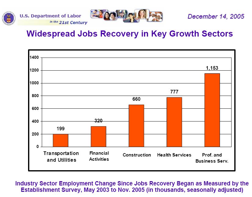
Click to enlarge
Now, at this blog, we've fooled enough with the Bureau of Labor Statistics data (the historical data for the 'B' tables to be specific) to immediately realize that there is something wrong with this chart and these words. They didn't pass the smell test for a nose that has been sniffing around the BLS data for a while now - a fair amount of analysis and mostly serious commentary has been offered:
The Quality of the Jobs
Trade and Transportation Jobs
One Last Look at the Jobs Data
So, what's wrong with the chart? The problem with the chart used by Ms. Chao, is that it has left out a number of very important explanations and a number of very important job categories.
First, the timeline starts in May 2003 which was the last bottom in the job market. Fair enough. You can't do that with stocks, but you can do it with jobs - pick the point in time that gives you the best results.
Next, the bars on the chart add up to 3.1 million jobs, but the total number of new jobs is stated as 4.5 million elsewhere - repeatedly. What's the difference? There are about 300,000 new Government jobs and about 300,000 fewer Manufacturing jobs. This is a wash, unless of course you used to work at a manufacturing job and were not able to land one of those new government jobs.
There are also two smaller categories which are not shown on the chart either. These are largely insignificant in the big picture - Natural Resources and Mining along with Other Services.
But, there are still over a million jobs to account for. Where are they? Well, it seems that jobs corresponding to nearly the entire consumer economy are absent from the chart.
Huh?
While shopping and dining out may be good enough for the GDP charts, they seem to have been cast aside for the job creation chart - maybe like the crazy aunt that lives in the basement.
They have been conveniently inserted into this updated chart: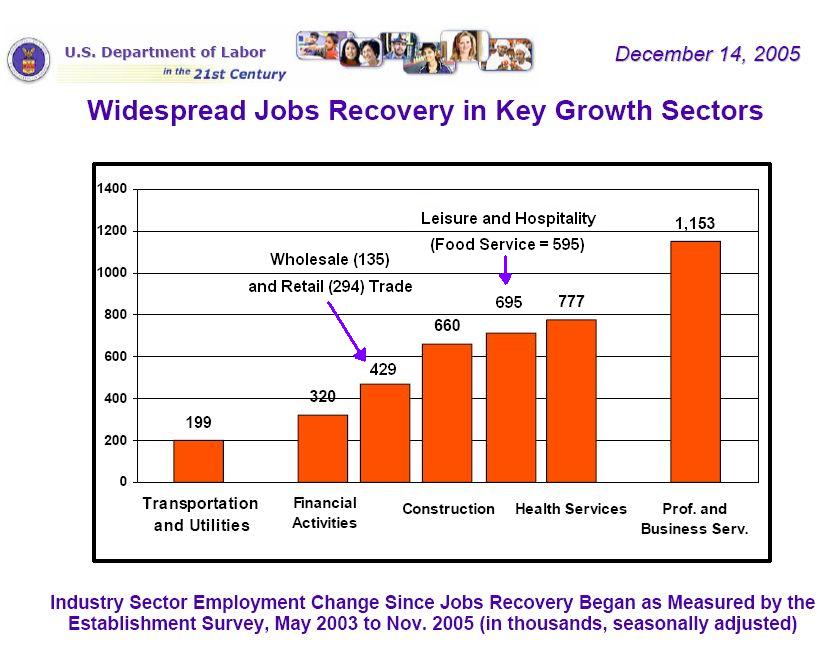
Click to enlarge
The very first category in Ms. Chao's chart, Transportation and Utilities, is actually part of the major category Trade, Transportation, and Utilities, which also includes Wholesale and Retail Trade. This would be new jobs at Wal-Mart and Home Depot and at all those outlet malls around the country that people just can't seem to get enough of.
While the rate of increase for these Wholesale and Retail Trade positions has slowed from the pace of a few years ago when home equity extraction first became a national pastime, it still accounts for a significant number of new jobs since May of 2003 - a lot more than the Utilities category, to be sure.
But, our favorite jobs category of all, and the one most representative of the U.S. economy today is the Food Service and Drinking Places category (part of Leisure and Hospitality), which clocked in with a 7 percent growth rate and nearly 700,000 new spots - more than the Professional and Business Services category if you subtract out all the temporary jobs, which now contribute a historically high percentage to this category.
So, why were Retail Trade and Food Service omitted from the chart?
Our guess is that they just don't look good and this briefing was all about shaping perceptions.
We'll have to take a closer look at some of the other charts now - especially the one that says that 63 percent of all new jobs pay above average wages.
That one really looks interesting.

6 comments:
from associated press
http://news.yahoo.com/s/ap/20051214/ap_on_bi_ge/ye_job_growth_ye5a
Ever since the labor market began improving 2 1/2 years ago, the housing boom has supplied an outsized share of new jobs. But if red-hot real estate is cooling, who will be hiring?
Restaurants have added close to 600,000 new workers since mid-2003. But the mix of new leisure and hospitality jobs could change in the coming year, with more hiring by hotels and resorts, experts say.
Demand is also strengthening for other types of workers.
The gambling industry is probably doing well.
63 percent of all new jobs pay above average wages
As median real incomes fall, is inflation diminishing the value of these new jobs, or do an even greater percent of all lost jobs pay above average wages?
All throughout the 1990s and up until 2003, temporary jobs accounted for between 20% and 25% of the Professional Services jobs. Since 2003, it is 36%. A sign that employers are reluctant to hire permanent staff?
Yeah, I'm going to have to dig into the 63 percent number - that doesn't seem to make sense. And, the percent temporary jobs out of Professional Services is something that I suspected looking at the BLS data, but I never did the calculation. Nice work dlp! You hear reports of many employers saying they are reluctant to take on permanent staff due to increasing benefits costs and uncertainty about future business.
Hey, I just got a blogger account.
Nice work Tim!
Post a Comment