Wikinvest Wire

To the Keystone State!

Thursday, October 20, 2005

Off to visit family and friends in Pennsylvania - in search of colorful fall foliage, we spy little other than showers in the forecast. Oh well... We do not expect to have anything to say on these pages until the end of the month, at which time it is likely that things will have gotten even more interesting - hard to imagine, but something we seem to be getting used to.


Read more...

For Discussion

This question has been asked a few times here before, in one form or another, but with little expectation of getting an answer - it has been more of a rhetorical question (also see this interesting entry at Wikipedia). It is being left today as a discussion topic, while we once again step away from the keyboard for another break.

The question is:

Do makers of monetary and fiscal policy really understand the mess that we are all in or are they out-of-touch and/or uncaring?

Knowing a little about the lives that policymakers lead, for example Alan Greenspan hasn't driven a car in eighteen years, it seems reasonable to think that maybe central bankers, many economists, and some politicians have lost touch with what it is really like to live and work in this country today.

Do they understand the mess that they have created in these dangerous asset bubbles and the twin deficits?

Do they realize how wage earners at the middle and lower part of the scale are getting squeezed, while the quality of new job creation continues to erode?

Do they care?

Read more...

Asia Times Online - Speaking Freely

Wednesday, October 19, 2005

News articles and editorials from Asia Times Online frequently come our way, and they rarely disappoint. It's not clear whether this is because others continue to find diamonds amongst the coal and feel compelled to share them, or because the writing there is overall, of consistently high quality.

Yesterday another gem came to our attention.

It seems that the report (warning - PDF) by John Embry and Andrew Hepburn of Sprott Asset Management, "Move Over Adam Smith: The Visible Hand of Uncle Sam", is getting much more attention around the rest of the world than here at home. Yesterday's article in Asia Times Online first appeared a few days prior in Japan Focus - a publication based just east of the Chinese mainland with a similar penchant for speaking freely.

The Embry/Hepburn work is well worth reading in its entirety. In addition to a well documented account of the Plunge Protection Team's surreptitious intervention in financial markets since 1987, it offers a few grim warnings about moral hazard precedents and unfair competitive advantage accorded to institutions aiding government agencies in the plunge protection work.

But even more intriguing than the report itself is the commentary by an unidentified writer from Japan Focus, which was reprinted in Asia Times Online:

If their account is correct, it means that US markets look a lot like the Japanese markets that were long derided for being subject to repeated official manipulation. A more important conclusion may be that US markets are even shakier than many believe.

The trail that the two analysts follow is long, dating to just after Black Monday, October 19, 1987. On that day, the US stock market abruptly crashed. The Dow Jones average dropped by 508 points, to 1738. It threatened to do even worse the next day when, after a brief rally, it went into reverse.

The markets seemed on the edge of a meltdown, but the abyss failed to open up. This lack of a meltdown has generally been attributed to the Federal Reserve Board's (FRB) steady hand and promises of liquidity. But sophisticated research on the events of those two days indicates that a sudden and unprecedented rise in the Major Market Index (MMI) sparked a recovery across the board. There is good reason to suspect that this recovery was the result of concentrated buying by a few firms.

It was after this crash that the President's Working Group on Financial Markets was put in place to prevent destabilizing declines. The Plunge Protection Team was institutionalized in 1989 as a follow-up from this working group, and originally included the top public-sector financial authorities.
On subsequent interventions that have become more frequent during the term of Fed Chairman Alan Greenspan, who is due to retire in 100 days:
This aggressive manipulation of the system took place on Alan Greenspan's watch as chairman of the FRB. The authors don't discuss the fact that Greenspan is to retire at the end of next January and the White House is having trouble finding a replacement in whom the markets will believe.

It may be that no credible candidate wants to take the baton from Greenspan at a time when it seems likely that the market will implode. Observers note that earlier changes of the FRB chair have generally been followed by much buffeting in the markets as they test the new maestro.

Market drops are common. Present risks include the American housing bubble blowing out, oil prices exploding, and inflation blowing in, at a time when the twin deficits of trade and budget are already in the troposphere.

This situation points to the likelihood that the Plunge Protection Team will be working overtime early next year.
It is likely that the author meant stratosphere, rather than troposphere, but when translating to English, funny things apparently happen.

The point here is that there seems to be growing awareness of the predicament in which the world finds itself today - the recipe of "bring to a steady boil, and remove Greenspan" could in fact be a recipe for disaster. No one knows the extent to which markets have been propped up over the last couple decades - as our Fed Chairman has been saying frequently as of late, stability may be breeding instability.

What's distinctly different this time around however, is that the most bubbly of all markets today is real estate. One has to wonder if the Plunge Protection Team has been gearing up to buy single-family homes in large quantities, if need be, over the next few years in order to keep the U.S. real estate market, and hence the world economy, from collapsing.

If they haven't, maybe they should be.

A billion dollars buys 2000 half-million dollar homes - what's a few billion more here or there each month. In December, maybe buy 1000 homes in San Diego, another 1000 in Boston, and 500 in Miami and Las Vegas - you get the idea - this could work wonders at keeping prices at levels where the citizenry will feel comfortable continuing to remove equity to support consumer spending in the new American world of zero-savings.

If some government agency could be set up to rent out these newly purchased homes, then that could create even more downward pressure on housing rental costs, and hence keep reported inflation, particularly reported "core" inflation at acceptable levels.

Just a thought.

Here are a few other recent Asia Times Online articles that are worth a look:

Read more...

Undaunted, Uninformed, Unprepared

Tuesday, October 18, 2005

Southern California real estate sales data for the month of September was released yesterday by DataQuick. Our charts have been updated with more lines that go to the right and upward. There's not really much new with this data - just more rising prices and satisfied buyers it seems.

It looks like Orange County and Ventura County may be heading for a showdown for the highest median price (they have tangled once before), while Los Angeles County and San Diego County have swapped places again this month a little further down.


Click to enlarge

Yes that's right, a median price, above and below which half the sales lie, of $600,000 for these two counties, home to almost 4 millions people.

San Bernardino continues to be the leader in year-over-year price appreciation, while San Diego has succeeded in reversing the 10 month long trend of declining year-over-year price increases. San Diego was headed for the zero line, but pulled up just in the nick of time to record a 3.8 percent annual increase, besting last month's 2.1 percent figure.

We make very few predictions here, but we did predict some time ago, that in the October data we would see the San Diego year-over-year median price crash through the zero threshold. We'll see - maybe the September uptick is an indication of a market in its "last throes".


Click to enlarge

Volume has been steady and rising - all year long. With the exception of surging San Bernardino County, all areas posted significant drops in volume from a year ago, but that doesn't seem to be that unusual - there have been a few steep fall-offs in volume in the last couple years, and real estate sales just keep on rolling.


Click to enlarge

It seems that Southern Californians remain undaunted in their quest for the American dream. As indicated in the DataQuick report, "strong demand and readily available financing" seem to be just the ticket to ever increasing home ownership. It is natural, however, to wonder how strong the demand really is and how readily available the financing can be.

This account from last week puts things in a little better perspective, here in Southern California:

I am a lawyer and I represent illegal aliens in deportation. In all but one of 35 cases I currently have on docket the illegal owns a home. But it is the loan terms that fascinate me. One lady finished school at second grade, speaks no English, and works for a recycling company binding cardboard boxes. She makes about $30K per year and is a single mom with three children. She has a $430K interest only loan that she used last year to buy a $430K condo - 100% financing - she paid $3,000 in closing costs. I tried to explain that her monthly payments will rise substantially in four years. She does not believe me, did not understand what I said and told me the loan and real estate agents specialize in real estate and would have told her if her payments could go up. If 34 of my clients with risky loans and no school past at best eighth grade are surprised by rising loan payments, we should be afraid. This is the last group desperate lenders pander to, meaning we're near the end.
That doesn't sound like the solid underpinnings of a healthy real estate market - not something on which you really want to base your future home appreciation estimates ... or your retirement plans. This is surely not typical, but it is telling.

It seems some Southern California homebuyers are uninformed and unprepared in addition to being undaunted.

Related to yesterday's topic of housing inflation we find this interesting tidbit from the DataQuick article:
The typical monthly mortgage payment that Southland buyers committed themselves to paying was $2,098 last month, down from $2,123 for the previous month, and up from $1,809 for September a year ago. Adjusted for inflation, current payments are slightly below their peak in the spring of 1989.
That works out to be a 16 percent increase from one year ago in mortgage payments. It's not clear how it was arrived at, and whether it includes any of the wacky financing options being chosen by more and more Southern California homebuyers, but it is one more data point that is inconsistent with the Bureau of Labor Statistics owner's equivalent rent increase of 2.3 percent over this same period.

Two point three percent. Ha!

Read more...

A Final Word on Housing Costs and the CPI

Monday, October 17, 2005

For anyone questioning the methodology used in my previous post today, please take note of the following chart. It is generated directly from BLS data using the database query at CPI home, and it tells the story all by itself.

This link will take you directly to the query page, and after a little fiddling with formatting options, you get this:


Shelter includes the following subcategories and weightings (as of 2003):

  • 19% - Rent of Primary Residence
  • 1% - Housing at school, excluding board
  • 9% - Other lodging - hotels and motels
  • 70% - Owner's equivalent rent of primary residence
  • 1% - Tenant's and household insurance
Something very significant happened in 1983 when owner's equivalent rent replaced the previous inflation calculation for owner-occupied housing. The older data, using the previous calculations for owner-occupied housing, is not available via the BLS, but it is clear that it would closely follow the above curve pre-1983, given the make-up of the shelter category.

Falling interest rates do not explain the low and stable shelter inflation on this chart.

Read more...

Home Ownership Costs and Core Inflation

There has been much discussion in recent days about the disparity between "headline" inflation and "core" inflation. Last Friday, headline inflation, which includes all items in the consumer price index, measured 4.7 percent over the last year, while core inflation, which excludes food and energy, came in at 2.0 percent over the same period.

Many have rightfully bemoaned the attention that economists, central bankers, and the financial media have given to core inflation. They say, excluding food and energy from the inflation discussion is disingenuous to the many millions of Americans putting gas in their tanks and heating their homes at ever higher expense.

This is sensible criticism to be sure - most people would have difficulty disputing the misleading nature of core inflation to the average consumer. However, there is an even more glaring problem with core inflation - the extent to which inflation reporting for owner-occupied housing distorts the end result.

Removing Home Ownership Costs from the CPI

It is common knowledge that the homeownership component of the CPI consists of owner's equivalent rent instead of the real cost of homeownership. As described in this New York Times article, this was done back in 1983, for what some would say were dubious reasons:

Until 1983, the bureau measured housing inflation by looking at what it cost to buy and own homes, considering factors like house prices, mortgage interest costs and property taxes. But given the shifts in interest rates and housing prices, those measures could show big bounces from month to month. Besides, homes are a strange hybrid of a consumable good and a long-term investment. As part of a long-running evaluation, the bureau wanted to "separate out the investment component from the consumption component" of the housing market, said Patrick C. Jackman, an economist at the bureau.
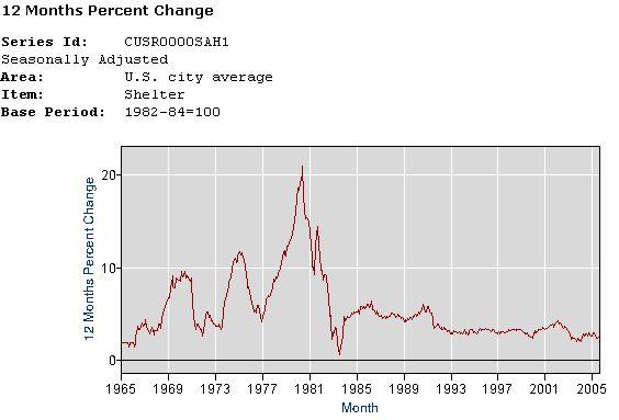
Not coincidentally, taking home prices out of inflation reporting seems to have had a very calming effect on reported inflation, as can be seen in the chart below. The effect has been particularly calming in the last seven years.


Click to enlarge

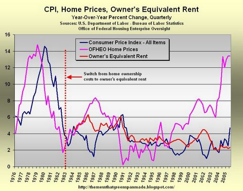
Note the relationship between CPI and home prices before and after 1983. It is clear that there is an entirely different relationship between the two before and after this time.

From 1976 (when OFHEO data first became available) to 1983, there was a clear relationship between the two - a one or two year lag between changes to home prices and changes to inflation, according to this chart.

Since 1983, home prices and inflation have mostly gone their separate ways. At times there has been a distinct inverse relationship between the two, as can clearly be seen during the housing boom and bust of the late 1980s. During this time, initially home prices rose as inflation fell. Then, when that housing boom went bust in 1990-1991, inflation ticked up noticeably.

This is significant and, no doubt, driven by the same dynamic that has been evident in recent years - as home prices rise, homeownership rises and demand for rental housing wanes, therefore depressing rental prices and ultimately putting downward pressure on the CPI. When housing cools, this process works in reverse - higher demand for rental housing, and upward pressure on the CPI.

This is an ominous sign for today's economy where housing now appears to be cooling - if home prices stagnate or decline, the impact on rental costs, and hence reported inflation, could be quite significant (it is natural to wonder whether, in this scenario, those calculating inflation statistics would deem it prudent to put real homeownership costs back into the CPI, replacing rising owner's equivalent rent).

Back to the Core

So, a natural question to ask, given all the discussion of inflation over the weekend, is "What if homeownership costs were to once again be included in the inflation calculation?" Home prices have clearly become "disconnected from their moorings" of rental prices, to borrow a phrase from Fed Chairman Alan Greenspan - maybe it's time to include them again.

In light of the discussion of "headline" inflation vs. "core" inflation, it is natural to ask, "What would core inflation be today if home prices were included?" Core inflation excludes food and energy, but it does include housing.

Your answer:
5.3%

Yes, that's right - almost triple the 2 percent core rate of inflation that has been hammered into the nation's collective consciousness over the last ten years, and particularly over the last few years.

Using publicly available government data, here is how that number was calculated:

According to the BLS (warning, PDF), owners' equivalent rent of primary residence makes up 23.1 percent of the All Items index. Since food and energy make up 22.2 percent of the total (14.3% food, 4.0% housing fuel, 3.9% motor fuel), then as a percent of "core" inflation, owner's equivalent rent is:

23.1 /(100 - 22.2) = 29.7 percent

Also per BLS data, core inflation for the last twelve months has been 2.0 percent while owner's equivalent rent was 2.3 percent. Before we can calculate a new core inflation rate using homeownership costs, we first solve for the core inflation rate exclusive of owner's equivalent rent:

(70.3% other core components * x percent) +
(29.7% equivalent rent component * 2.3 percent) =
2.0 percent core inflation

x = 1.87 percent

Now, using the 13.43 percent increase in home prices from Q2-2004 to Q2-2005 as reported by the OFHEO, and as quoted by Fed Governor Susan Bies just the other day, substitute for owner's equivalent rent and calculate core inflation anew:

(70.3% other core components * 1.87 percent) +
(29.7% equivalent rent component * 13.43 percent) =
5.3 percent core inflation

It seems that including homeownership costs instead of owner's equivalent rent in the calculation for core inflation gives it an entirely different feel.

Notes:
  1. While admittedly quite important to homeownership costs, interest rates and property taxes have been omitted from the above calculations. The reason for doing so is that mortgage rates have been flat over the last year, the time period applicable to this calculation, and property taxes generally scale with home prices. For this period of time, the change in home price alone is representative of the change in home ownership cost.

  2. OFHEO housing price data from Q2-2005 is used here, as no subsequent data is yet available. The inflation data from the BLS is from Q3-2005, however, this misalignment is not expected to result in any significant change to the calculated results, as the OFHEO data has been fairly consistent over the last five quarters, ranging from 10 and 13 percent, and trending up.

  3. A similar calculation for headline inflation yields 7.3%.

Read more...

Money Magazine Says "Uh-oh"

Sunday, October 16, 2005

In a continuation of their apparent reversal regarding the housing bubble, the November issue of Money Magazine has two articles on home improvement and one warning about the perils of buying property with family or friends. Discussion of home prices is absent, with the notable exception of this graphic:


Why do we pay so close attention to what Money Magazine says?

They are the most popular personal finance magazine in the country with a circulation of almost 2 million, and they been housing cheeleaders up until last month.

It is clearly disingenuous for them to ask, "Are owners trying to get out while they can?"

For previous posts on Money Magazine and real estate, see:

Money Magazine Does a One-Eighty
Money Magazine Does Real Estate
Money Magazine on "Cashing Out"
Why is This Couple So Happy?

Read more...
IMAGE

  © Blogger template Newspaper by Ourblogtemplates.com 2008

Back to TOP